How to Make a Great First Impression Through Branding & Design

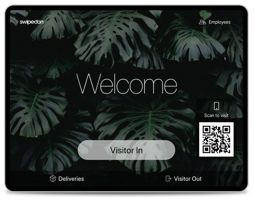
Looks matter. Wait… let us rephrase that. When it comes to your SwipedOn iPad home screen, looks matter. Your home screen is essentially the first touchpoint that connects visitors to your brand when they step foot in your office. So you want it to look good, right?
In our latest 2.10.0 product update, we’ve introduced a cleaner design to the layout of the SwipedOn app's home screen to better showcase your brand.
We can’t all be visual designers. So with the recent changes to our home screen, we thought we’d call on our resident designer Scott to help nail a few basics in creating a beautiful first impression.
We’ve also thrown in some of our favourite screensavers for an added slice of creative inspiration.
In this video, SwipedOn's expert UX & UI Designer Scott takes you through the customization settings for your iPad, so you can make a great first impression that represents your brand.
1. First and Foremost… Utilise your Company’s Brand Style Guide
When it comes to customising your iPad, be sure to utilise your company's brand style guide to ensure brand consistency. Pulling out your brand style guide enables you to reference colours, hex numbers, and imagery that encompasses your brand.
If you get really stuck, have a chat with your marketing team or the agency who helped with your brand design. They’ll be able to assist with identifying colours, suitable imagery and that thing called a ‘hex number’.
2. Keep Custom Screensavers Simple
As they say, less is more. The same applies when selecting custom images for your screensavers.
Consider:
- Where buttons will be - don’t upload an image where the main subject or object is positioned at the bottom of the frame.
- Use simple, bold images, with little detailing and pattern to get the best result.
- Be consistent. Don’t use a mix of light and dark images - stick to one or the other.
- Will your iPad will be displayed in a portrait or landscape orientation?
3. Button Colour Best Practice
When selecting a colour for the 'Visitor In' button of your iPad, pick a colour that contrasts well with the text colour you choose. Text colour for iPad buttons include: black, grey or white.
Keep in mind, the button colour you choose will be made slightly transparent so the background behind it shows through.
If you’re using Employee In/Out, ensure that all of your screensavers are similarly light or dark in the top right corner. This will make the ‘Employee’ button more prominent.
Expert tip: We recommend using darker coloured buttons with all text set to white.
4. Colour vs Contrast
Contrast is key. Contrast is a crucial element you need to consider when uploading background images and picking an accent colour.
A good rule of thumb is if you have a dark coloured background you should use a light font (and vice versa).
You can change the accent colour to match your corporate colours. This will change the banner and button colours found inside the iPad App. Make sure you pick an accent colour that will contrast well with the text colour you choose. It has to look good, but it also needs to be legible for your employees and visitors.

5. Showcase Your Logo Front & Centre
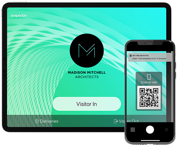
If you’ve chosen to have your company logo displayed, it will automatically be positioned in the centre of the screen. Consider contrast with your screensavers - a single coloured logo may be best if your screensavers are photos. For best results, use high quality, transparent png images.
Ask your marketing team for the highest quality image that fits within 2 MB.
6. Get Creative
If you’re really wanting to impress your guests, take advantage of SwipedOn's rolling screensavers to create fun animations or a collection of backgrounds.
Customising your iPad is all about exploration and experimentation. If you require a little more assistance - we’re here to help. Check out our Branding and Design help doc for more info. Or simply reach out via the live chat bubble in the bottom right of your screen.
If you haven’t already, download the latest version of SwipedOn Visitor Management (2.10.0) from your app store to take advantage of our updated home screen layout. Here's how.


 Germany - Deutsch